 株式会社レクタス
 ホームページアクセスログ解析
 追跡・トラッキング機能
 ページ閲覧解析システム
 アンケートフォーム
 認証付きダウンロード機能
 パスワード不要な会員サイト
 会員制不要なオンライン展示会
 メール配信システム
 営業支援システム
 ホームページ制作勉強会
 ホームページ制作&コンサル
 商品企画コンサルティング
 営業コンサルティング
 ホームページメンテナンス
CSSで二重の目のマークを作成する
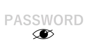
CSSで二重の目のマークを作成する方法
CSSで目のマークを作成するで作成した目のマークを二重にしました。作成手順はCSSで目のマークを作成する手順に加えて実装方法を後述します。
サンプルコード
HTML
<div class="togglePassword">
  <input type="password">
  <span class="eye">
    <span class="iris"></span>
    <span class="light"></span>
    <span class="doubleEyelid"></span>
  </span>
  <span class="slash" style="display:none;"></span>
</div>
二重用にclass="doubleEyelid" の span タグを用意しました。
CSS
.togglePassword {
  position: relative;
  display: inline-block;
}
/* 目の輪郭 */
.eye {
  position: absolute;
  width: 19px;
  height: 19px;
  border-radius: 90% 0 90% 0;
  transform: rotate(45deg);
  top: 50%;
  right: 5%;
  border: solid 0.1rem;
  margin-top: -11px;
  background: white;
}
/* 黒目 */
.iris {
  position: absolute;
  width: 12px;
  height: 12px;
  border-radius: 50%;
  top: 50%;
  margin-top: -7px;
  right: 18%;
  background: black;
}
/* 黒目に入る光 */
.light {
  position: absolute;
  width: 3px;
  height: 3px;
  border-radius: 50%;
  margin-top: 4px;
  right: 40%;
  background: white;
}
/* スラッシュ */
.slash {
  position: absolute;
  height: 30px;
  width: 1px;
  transform: rotate(65deg);
  top: 50%;
  margin-top: -15px;
  right: 11%;
  background-color: black;
}
/* 二重 */
.doubleEyelid {
  position: absolute;
  width: 19px;
  height: 19px;
  border-radius: 100% 0 0 0;
  top: 40%;
  right: 8%;
  border: solid 0.1rem;
  border-bottom: none;
  border-right: none;
  margin-top: -11px;
}
二重ですが、四分円の border-bottom と border-right を none にすることで、弧のみを表示して二重に見えるように配置しました。
ご質問等ありましたら,お手数ですが弊社の個人情報保護方針をお読み頂いた上でフォームからお願い致します.
※このページと無関係な内容のセールスはご遠慮ください.